
Bumble BFF aims to help people make new friends online without making it weird.
Bumble BFF
Team: Alpha Moon
Client: Bumble
Research lead: Jane Moon
Design Lead: Sarah Nafees
Project Manager: Robin Gibbs
Tools: Figma, Miro, Trello, Slack, Zoom, Adobe PS, Googel Docs
Matchmaking
Forming new friendships can be awkward, especially in the age of Zoom. Getting the customer experience just right makes or breaks this process.
Since the main goal is to make matches, our Mission is to make the time spent in this friending app a whole lot friendlier.
Let us begin..
The Challenge
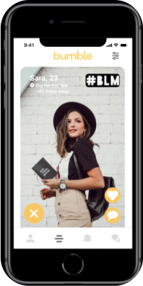
Right now, Bumble’s friend-matching app is essentially a clone of their dating platform
You can only search for friends of the same gender, and must make a binary decision on whether to pursue friendship with them - match, or no match.
Bumble wants us to refine and add features to make the friendship search more effective.
To approach this challenge we had to consider:
What is a friend?
Are there different social norms when it comes to pursuing and managing friendships, as opposed to a romantic relationship?
What is inherently stressful or awkward about pursuing friendships? And how can we minimize those effects?
How do we determine success in the friend search?
We conducted 4 user interviews and we asked questions to determine...
What they looked for in a friendship (like Location proximity and Similar interests)
Their experiences using bumble or similar apps
What do they determine a success and a failure in these interactions ( such as whether or not the person shows at the agreed upon meeting time)
We then conducted current state usability tests following the prompt to
1st Set up a profile,
2nd match with a person,
3rd check messages,
And 4th to look at previous matches
Our user interviews revealed a few major pain points:

They found the app to be too limiting because they wanted to be able to match with any gender.
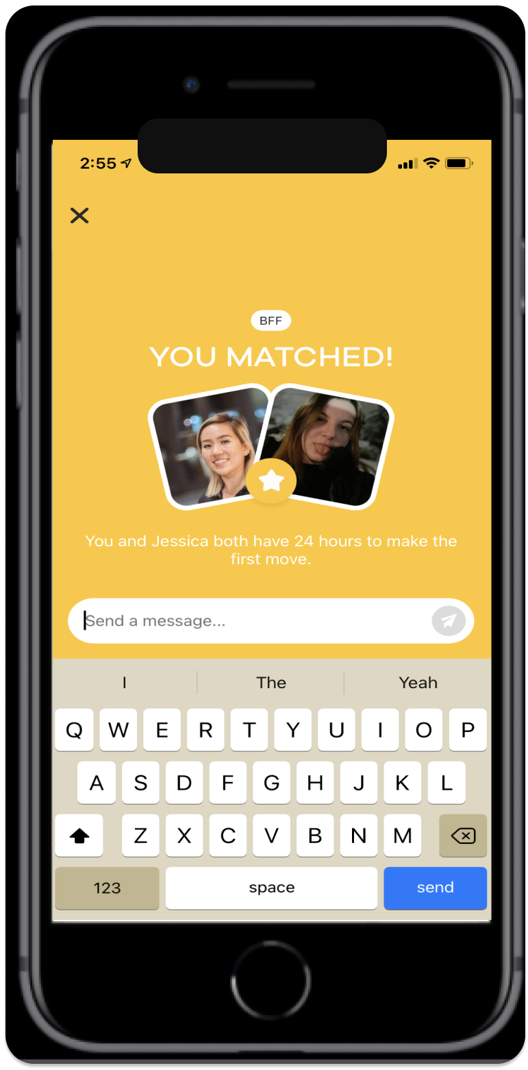
Users did not like that they had only 24 hours to reach out to their potential matches before the match disappeared
Users felt that constant swiping can be desensitizing. Mindless swiping and low effort matching causes people to end up with multiple matches they wouldn’t necessarily talk to.
Many found it stressful or awkward to send a direct message as the first move and said they had trouble coming up with icebreakers when trying to make friends. They felt there needed to be more organic options for creating connections.
Current State Usability Test Results
More Options, Please.
Our current state usability testers found Profile Settings to be straightforward, but they wanted more options In order to further customize their personal profiles and more access to a potential friend’s interests and photos before making the decision to interact.
Our Persona
Kaylee Smith, Age 22...
Kaylee is a busy professional who recently moved to Seattle and is looking to form meaningful friendships., who wants to be able to meet similar people without needing to constantly check her phone.
She uses Bumble, Instagram, Hinge, Tinder to meet people.
Her needs include:
Seeing detailed descriptions of interests and hobbies of potential friends that live within a 25 mile radius, an easy solution for her busy schedule, an easier way to break the ice when matched and being able to connect with people regardless of gender
Her frustrations are:
Feeling awkward and pressured when making the first move and despises direct messaging first and is tired of having bad experiences on apps like Tinder, Hinge
Doesn’t like daily swiping limits or the 24 hour match reply window, finds constant swiping to be desensitizing and wants to know political views of her potential matches
The Customer Experience
We created a journey map where in this scenario Kaylee just moved to Seattle and is looking for a way to make friends in her age group with similar interests.
She comes across bumble bff and expects to find like-minded people nearby whom she can easily connect with.
After setting up her account at bumble bff she starts to browse profiles to find possible matches by swiping right to match and left to ignore.
As she is looking at different profiles, she notices there isn’t much detail as she’d like to see and can only view profiles of the same gender.
She runs out of profiles to swipe pretty quickly and her thought is that the app is too limiting.
She gets excited every time she gets matched with someone, but feels pressured and awkward in coming up with icebreakers herself when messaging a stranger.
Some of her matches disappeared because she couldn’t find the time to reply.


Proposed State User Flow
If a new user enters this app, they will be taken through the steps to create an account and become a verified user.
If they are already registered they will land on their profile setup page where they can edit their details.
The next step is to look for matches. If they are interested in a profile they would comment or like a photo or prompt.
If they respond back, they become a match and exchange messages. If they’re not interested they would swipe left or press X.
If they received a notification, meaning comment or likes, they can view the user’s profile and decide whether they want to reply back in order to match or X to pass.
Mid-Fi Wireflow
This is the profile setup page where user enters their details for what they want other people to see.
The main matches page is where they can go through other profiles and decide whether to match or pass.
They would click on the comment bubble to comment on a photo or prompt, which would be notified to the other user.
They can use the BFF filter to specify what type of profiles they want to see.
In the notifications tab they will receive comments or likes sent to them and by clicking on the bubble they can view their comment in a chat box where they can reply back if they want to match.
The last tab is the messages page where user can only see the conversations with people they’ve matched with.

After conducting 3 usability tests we found that users were confused by the placement of the comment icon above the picture and on the picture. They felt that the comment icon was actually a direct message icon.
Advanced filters: Users felt it was unnecessary to have age and distance filters in both advanced and bff filters.
Notifications: Users were not sure where on the screen to click and what the page was doing. So we turned the comment rectangles into message bubbles so users know this would be displayed in a chat box where the user can reply. And we provided a quickview of the profile of the person who commented/liked.
After clicking on the comment, users were confused on what would lead to a match, so we added an extra screen to show what would happen after they reply to their comment.
We conducted usability tests on our high fidelity prototype with 3 testers.
The main takeaways from them were…
They expected feedback from leaving a comment.
They couldnt tell the different between a like and a comment notification. We tried putting a different color, but it seems that it was still confusing to the testers.
It was hard to tell the difference between the comment and messages navigation button. Before we actually had the exact same icon, but we changed the message icon later to a different one.
