
Voxpopin
Team: BARE
Client: Voxpopin
Research Lead: Ashlynn Hernandez
Design Lead: Bryan Harshberger
Project Management Lead: Robin Gibbs
Tools: Figma, Miro, Trello, Slack, Zoom, Canva, Googel Docs
Voxpopin’s goal is to find the best way to allow users and influencers to view and exchange videos, while simultaneously creating a sense of community without the use of a traditional comment section.
VoxPoppin Prototype

Vox Popin seeks to build an influencer led video driven online community without the use of comments. Our target audience is a Gen Z or Millennial who is highly connected.
Project goal: After speaking with, the client, we surmised that our goal was to find the best way to allow users and influencers to view and exchange videos, while simultaneously creating a sense of community without the use of a traditional comment section.

Our User interviews gave us a lot to consider regarding how our end users interact with other users on social media. This includes:
Comments
Polls
Up/Down Votes
Shares
Saves
Emojis
Emoticons
Much of the time, the behavior we observe online amounts to more of a non-social media than a social or rather civil one.
The never-ending quest for perfection...i.e the perfect zinger, the perfect snark remark, the perfect selfie leads many into perfectly self destructive ONLINE AND OFFLINE behaviors.

We took a few approaches to our user interviews.
Our first go at it addressed topics surrounding how people interacted with their elected officials and politics on social media. We realized that this approach while not incorrect and still applicable, was not totally addressing the main concern of community and connection.
So, we decided to pivot. Our goal in this second round was to really get a feel for what our users' habits and emotions are in regards to social media as a whole.
We redrafted our questions to dive into what platforms were favored and why. What kind of accounts people followed and why. How users interact with these accounts and what interactions elicited positive responses. We also wanted to understand which environments fostered a community of trust, inspiration, and inclusion.
Our post-user interview Affinity Mapping was extensive and we had a number of insightful responses.
We combined findings from both rounds that we feel gave us a great understanding as to what users like and dislike about this social world we live in.
However, almost all of our users expressed that these tools have the opportunity to do a lot of good as well as bad.
This is represented with quotes like I don't think these tools are inherently evil, and we need to have a clear understanding of why these things exist and try to use them for the better.
With the insights gathered from our interviews, we were able to create a persona. The Tech-savvy environmentalist.
Touila, age 22, is an environmental science graduate, who just started her career as a conservationist in DC.
She enjoys staying connected and frequents Tik Tok, Twitter, Facebook, Instagram, and Reddit to keep updated on various hot topics. But tries to limit her time on social platforms to have a healthy balance.
She wants a way to communicate in positive face-to-face interactions.
She wants to feel connected to communities.
Overall wants to maintain a healthy relationship with platforms and the people using them.
She is frustrated with the negativity of comments and the lack of moderation that leads to cyberbullying. She gets frustrated when engaging with people who are uninformed. And is very discouraged by the inauthenticity of our social landscape.
We narrowed our scope to the following three questions:
How might we :
Build a sense of community without the comments?
Allow the formation of safe communities where people can connect?
Create a space that allows for the exploration of new topics and ideas?
PAIN POINTS
Our problem statement discussions kept circling back to the need for a mentally healthy online experience.
Toulia wants a respectful discussion on social media when engaging in anything that could bring a difference of opinion.
She also needs to be able to thwart the enabling of comment trolls, hate speech and threats of violence.
Like a pain chart in the Doctor's Office, we realized Toulia needed to find the best possible way to avoid the negativity and to create and environment where others could DO NO HARM.
Toulia hears about an influencer from one of her friends that may be of interest to her.
She easily searches for the influencer, Anthony Caere, and is thrilled to see he's on VoxPopin.
She browses through her content and is really pleased to see that what he posts is relevant and educational.
She follows him and realizes that there's also an exclusive community feature. Toulia decides to join the community and automatically has access to exclusive POPs, SWAPs and additional content. She can also post pops directly to the community.
She feels really inspired by what she saw and decides to start a conversation of her own so,
She creates a POP about the state of the planet and waits for SWAPS.
Once we wrapped up our research we decided to give the existing prototype a spin through usability tests.
We conducted 2 current state usability tests to get a handle on what features users liked, the intuitiveness of the interface, and what, if any, changes could be made to create a better experience.
Results:
There was confusion surrounding where the home/main feed page was.
Users asked: Is this supposed to be TIK TOK? Is meant to be a Facebook product? and fell back on previously learned behaviors looking for familiar navigational and communication UI patterns..
Both interviewees needed explanations for the global view and pop icons.
Both noted that the on-screen tools took up too much real estate which felt cluttered.
They also stated that the lollipop slider was not easily understood to be an up/down vote.
The act of making pop and INITIATION of a swap needed extensive explanations as well.
Using the insights from our user interviews and the pain points expressed in the usability tests, we embarked into the design phase.
FIRST ROUND OF CHANGES:
Some of the first changes we made were to add a home screen that felt more traditional to social media users.
We added header navigation to show the pops, swaps, and a life feed.
From your pop feed you can see posted pops and engage with them.
In Swaps, you can see pops that have been engaged and the live feed shows anybody live streaming.
When posting a pop, we added the feature of pre-populating topics.
We also updated the recording feature to be more intuitive.
Changed the POPs record button to a pulsating button that could be paused and resumed and added a review/edit function.
In the Create a POP frame, we added topic bubbles for users to include those topic tags in their POPs
We also added some white space and changed bottom navigation bar in response to users asking for less on screen clutter...we also considered making the SWAP videos appear under the POPs in an expanded area.
Here you see the original live view which users said felt a little cluttered.
The bones were really good, we just made some minor adjustments.
We got rid of the navigation menu at the bottom and created user engagement buttons.
Commenting, requesting to be added to the live conversation, submitting questions to the user or mod. The ability to share the live link with friends. And finally the ability give positive affirmation in the form of claps.
SECOND ROUND OF CHANGES:
Our first goal was to create a conventional home page.
We decided on a feed because let's be honest, it works. We went with what felt traditional.
Although it felt fine originally, one particular user commented that it felt... old. “It felt Facebookish.”
Which is NOT something that we wanted to convey.
He told us to look beyond...
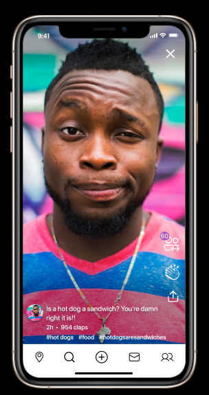
We went with a sleeker look. Less of a facebook product and more modern. In the vein of Tik-Tok and Snapchat. We went almost full screen with every post in the feed. With a click anywhere on the video it opens to full screen to autoplay and give added functionality.
The first go at the home page included a pops feed and a familiar Facebook landscape.
After much deliberation, we elongated the video as seen in the second frame which is the new profile home page, added a gradient for increased readability of the white text and added purple hot topics bubbles overlaid on the video
We removed the top navigation, standardized the nav bar icons sizes and added a live pops button on the top right.
The final frame is gave the pops all the real estate adding the overlaid claps, swaps and share icons. We also removed the purple topic bubbles
SAFETY CONCERNS:
Our client was very serious about creating an environment that protected the end users’ mental health and well being.
During user interviews, we had people say, if I don't have the ability to block people, I'd never use the app. We added options to protect users mental health and well being. The ability to block users was paramount.
THIRD ROUND OF CHANGES:
The page to create a pop was good, but users expressed that it had a cluttered feel. We cleaned it up a bit and added the ability to add topics that are pre-populated based on what's currently trending based on other users pops.
You can also see some changes from our version two which didn't have any of the options below tagging hot topics. From version 2 to version 3 we added sharing options and swapping options.
One Frame from the Beta version was divided into 4 frames.
We added an auto complete function in the search field for to prevent topic misspellings.
Top ten trending topics we also added.
Lastly, we included pop sharing and privacy settings.
We added a robust search feature which will allow users to search for other users, topics, events and more.
At the top of the main search page, we added a banner showcasing topics of interest to users, and live events coming up.
Searching for a user brings up results in real time.
We find who we're looking for and originally we had just a follow button along with social media links the users could input.
After speaking to you Lauren, you stated that in a meeting you had with a significant social influencer, he felt that as much as he loved the app, he missed the sense of community that other apps provide with the inclusion of comments.
We came up with a potential solution.
A join button next to the follow button. This will allow users to join the persons community if the content creator wants to create one. This will afford the creator options that would only benefit community members. Options such as exclusive content in the form of pops, swaps, messages posted only to the community, and much more.
This community button is also represented in the member navigation by a globe.
This time we tried to focus entirely on the community building task we were given.
This new interface allowed users to search for pops by trending topics and providing a headlines scroll on the top.
The influencer or user profile search was created so that people can easily search and locate the community builders or friends.
Once on the Profile page we created additional navigation to individual pops and swaps tabs.
Profile page allows navigation to pops and swaps

PROTOTYPE FEEDBACK:
“A MORE EDUCATED VERSION OF TIK TOK"
POPS and SWAPS make more sense now.
She likes the internet bubbles in the headline area of each POP.
Likes that we DO NOT enable ASTROTURFING by disabling the video uploads.
REFLECTIONS
In reflection speaking for the group, we felt a great sense of gravity in being part of an app that has the potential to change the way we could engage in constructive social discourse.
This app is not only important to it's creator, and us, but to the millions of people who don't know it yet exists, but hopefully will soon.
NEXT STEPS:
Live SWAPS
Allow users to become Community moderators
Create Groups
Build out exclusive community content.
Perhaps Community Content can include live/archived footage from demonstrations, lectures, speeches, reports, and more.
