

A Website Overhaul
Company: Richard’s Variety
Tools: Trello, Miro, Canva, Figma, Slack, Zoom
Timeline: 3 Weeks
Role: Solo Project Manager/UX Designer

About Richard’s Variety
Richard’s Variety Store is a family owned business owned and operated in the City of Atlanta since 1951. They offer housewares, greeting cards, hardware, classic and new toys, books, games, novelties, costumes, candy, cookware and office supplies.
THE CHALLENGE

The current desktop UI needs a new look and category streamlining along with some more modern touches to ensure that the online brand continuity is preserved while making the online shopping experience more comparable with other online retailers.
USER INTERVIEWS
Covid Shopping Amplified Pain Points
With the Covid 19 pandemic curbing and disturbing many in store purchasing excursions, it became important to determine what products and services people felt they needed enough to risk infection and crowd control issues.
At the bottom of what drives someone to shop in person was the need to determine the quality of a product like food, clothing, furniture and appliances and then personally select that item. Many experienced shipping delays during the 2020 USPS restructuring or missed and lost deliveries entirely.. Sometimes, purchasing online and then opting for curbside or in-store pickup was another draw for people looking to minimize Covid exposure.
“The trial and error of online shopping versus in person requires a lot of risk in relying on user reviews and product descriptions to determine the quality of a product without being able to see or touch it.”
AFFINITY MAPPING
The Affinity Mapping portion produced a list of pain points and problem statements about the current climate of online shopping experience versus in person shopping.

Crowds
Covid
Shipping Fees
Lack of inventory in store
Needing comparison tools like pricing and user reviews
Needing in store experiences for some items
At the bottom of what drives someone to shop in person was the need to determine the quality of a product like food, clothing, furniture and appliances and then personally select that item. Many experienced shipping delays during the 2020 USPS restructuring or missed and lost deliveries entirely. Sometimes, purchasing online and then opting for curbside or in-store pickup was another draw for people looking to minimize Covid exposure.
Brick & Mortar vs Online Shopping
The in-store shopping experiences of seeing familiar faces at local stores like Richard’s Variety versus the isolation of online interfaces became more and more of a lure. That’s the value-add of in-store. Value-added marketing refers to the enhancement brought to a product or service by the service provider. Basically, what makes the service better than the alternative and therefore worth the buyer's money. Definitely worth it for getting covid-weary amazon or Costco shoppers to purchase locally again.
Personality goes a long way
The in-store shopping experiences of seeing familiar faces at local stores like Richard’s Variety versus the isolation of online interfaces became more and more of a lure. That’s the value-add of in-store. Value-added marketing refers to the enhancement brought to a product or service by the service provider. Basically, what makes the service better than the alternative and therefore worth Ariel’s spending money. Definitely worth it for getting covid-weary Ariel to purchase locally again.
PERSONA


Problem Statement
Value-Added Ariel needs the online shopping experience at Richard's to feel more like the quirky and nostalgic experience of being in-store while providing some of the conveniences of online stores like amazon.
How Might We
Make the website more reflective of the in-store experience Ariel enjoys.
Make the browsing feel more exploratory and entertaining for Ariel.
Make the checkout process more appealing to Ariel.

Major Pain Points
Users complained that colors looked like error or warning screens, the shopping cart seemed to belong to a disconnected website and that the quality of the site looked more like an adult store.
Sketches
Ariel wants to spend as much time browsing and exploring the products as she would in person so the goal is to make the journey on the redesigned site to be as pleasant as reaching the destination. In this case that would be locating and buying those items with no blockers or design driven obstacles.
A few quick sketches of the ideas for making Ariel’s time on the overhauled Richard’s Variety site more quality and less quantity by centralizing navigation and balancing the look and flow of the site including product descriptions and user reviews.
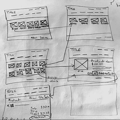
The first pass made at sketching aimed at deciding what navigation was needed, how to consolidate categories into what was the most natural groupings of products and how to showcase frequently purchased items in the main frame of the homepage.
Wireframes & Usability Tests
Our wireframe was a simplified version of the future interface again adding the 5 category centered top navigation which would have centralized navigation at the top which Ariel can click to reveal subcategories and a clear uncluttered path to the shopping cart.
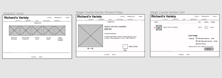
Usability testing revealed that the site was a little too pared down and would need more featured product categories on the homepage, additional product review and user review and suggested or related products as well.
Hi-Fi Prototype Video (press play)

Design Solutions
Changes to Information Architecture - homepage interface updates (better photos, user reviews, product descriptions) design streamlining (decluttering the site, i.e. category consolidation, remove left navigation updates including, symmetry of photos and text to alleviate the stress on eyes) Thereby making the online shopping experience more fun and lighthearted.
USER Feedback
Liked the improved photo and photo label symmetry
Was glad to see the sidebar navigation removed and replaced with the consolidated top navigation bar.
Homepage was easier to understand... "easier to digest"
Product reviews, user reviews and related products help users to drill down into the product offering much easier than having to figure out what else was there.
Retrospective
Some were willing to battle both the competitive nature of leaving the house and interacting with a crowd of strangers on top of the anxiety of not knowing if the outing would be successful because of the need to determine quality. But in the case of Richard’s Variety, it was perhaps only for the very basic need to get out of the house as a form of peak pandemic entertainment or to look for gifts or speciality items.
Since most users preferred online shopping for comparative pricing and competitive pricing or product research, making the customer more comfortable with Richard’s variety was very important. This comfort level and meeting their research needs kept them online for longer to spend more dollars.
